
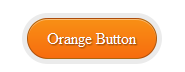
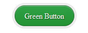
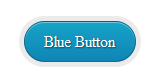
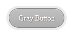
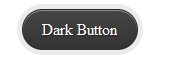
you can see demo of these buttons on above image so follow my steps to add these buttons in your blog.
Features
- small coding
- no effect on blog load time
- available in many colours
- hover effect
- full css
Demo
Click here for demo
Steps
- goto blogger dashboard
- edit your blog html
- now click proceed and click on expand widget
- now find ]]></b:skin>
- and paste the following code above this code
/* Exciting Round Buttons By YOURPCGENIE.NET*/
.excitinground{ background: rgba(0, 0, 0, .08); display: inline-block; padding: 5px; border-radius: 30px; -moz-border-radius: 30px; -webkit-border-radius: 30px; }
.excitinground a { color: #fff; border: 1px solid rgba(0, 0, 0, .3); display: inline-block; padding: .6em 1.2em; position: relative; text-decoration: none; text-shadow: 1px 1px 1px rgba(0, 0, 0, 0.5); border-radius: 30px; -moz-border-radius: 30px; -webkit-border-radius: 30px; box-shadow: inset 0 1px 0 rgba(255, 255, 255, .4); -moz-box-shadow: inset 0 1px 0 rgba(255, 255, 255, .4); -webkit-box-shadow: inset 0 1px 0 rgba(255, 255, 255, .4); }
.excitinground a.red { background: #c60000; background: linear-gradient(top, #c60000 0%, #b20000 100%); background: -moz-linear-gradient(top, #c60000 0%, #b20000 100%);
background: -webkit-gradient(linear, left top, left bottom, color-stop(0%, #c60000), color-stop(100%, #b20000)); background: -webkit-linear-gradient(top, #c60000 0%, #b20000 100%); }
.excitinground a.orange { background: #f99015; background: linear-gradient(top, #f99015 0%, #f76c0f 100%); background: -moz-linear-gradient(top, #f99015 0%, #f76c0f 100%); background: -webkit-gradient(linear, left top, left bottom, color-stop(0%,#f99015), color-stop(100%,#f76c0f)); background: -webkit-linear-gradient(top, #f99015 0%,#f76c0f 100%); }
.excitinground a.green { background: #30a146; background: linear-gradient(top, #30a146 0%, #249334 100%); background: -moz-linear-gradient(top, #30a146 0%, #249334 100%); background: -webkit-gradient(linear, left top, left bottom, color-stop(0%, #30a146), color-stop(100%, #249334)); background: -webkit-linear-gradient(top, #30a146 0%, #249334 100%); }
.excitinground a.blue { background: #16a4c8; background: linear-gradient(top, #16a4c8 0%, #1086b6 100%); background: -moz-linear-gradient(top, #16a4c8 0%, #1086b6 100%); background: -webkit-gradient(linear, left top, left bottom, color-stop(0%, #16a4c8), color-stop(100%, #1086b6)); background: -webkit-linear-gradient(top, #16a4c8 0%, #1086b6 100%); }
.excitinground a.gray { background: #c2c2c2; background: linear-gradient(top, #c2c2c2 0%, #aeaeae 100%); background: -moz-linear-gradient(top, #c2c2c2 0%, #aeaeae 100%); background: -webkit-gradient(linear, left top, left bottom, color-stop(0%, #c2c2c2), color-stop(100%, #aeaeae)); background: -webkit-linear-gradient(top, #c2c2c2 0%, #aeaeae 100%); }
.excitinground a.dark { background: #464646; background: linear-gradient(top, #464646 0%, #343434 100%); background: -moz-linear-gradient(top, #464646 0%, #343434 100%); background: -webkit-gradient(linear, left top, left bottom, color-stop(0%, #464646), color-stop(100%, #343434)); background: -webkit-linear-gradient(top, #464646 0%, #343434 100%); } .excitinground a:hover, .excitinground:hover { color: #fff; opacity: .7 }
Now save the template .
Using of these butons in post
whenever you want to use these buttons in post please use below codes in your posts.
.PNG)
.PNG)
.PNG)
.PNG)
.PNG)
.PNG)
<span class="excitinground"><a class="red" href="http://www.YOUR-LINK-HERE.com/">YOUR TEXT</a></span>
Replacing
- replace red colour with your favourite colour i.e red, blue, green, orange, gray, dark
- replace your text with your own text
- replace your link here with your link.